final work
For a tiny house project in Salt Lake City designed for a couple who like camping and working out, I name this house “Home of My Ego”, which comes from the word “home”. When making this project, I keep considering the meaning of home, especially of tiny home for low / moderate-income group. Home is a place that provides dwellers with warm and sense of belongings. It is usually hard to store all the things meaningful to them in such a narrow and small space, let alone to avoid looking messy. Therefore, this time, the concept of my project is to design an affordable sustainable tiny “storage house” that could accomodate not only the couple but also the objects and activities they love and enjoy. It is really a home of their egos.
#### Floor area 32.8㎡ (353sf) (first floor–21.9㎡ + second floor–10.9㎡)
#### Interior Volume: 108m³
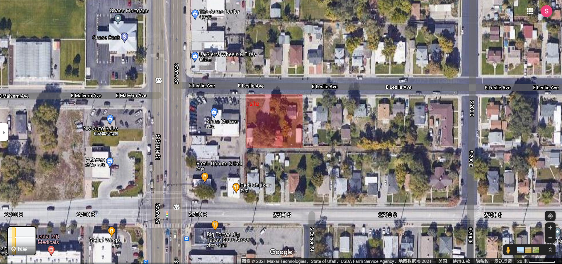
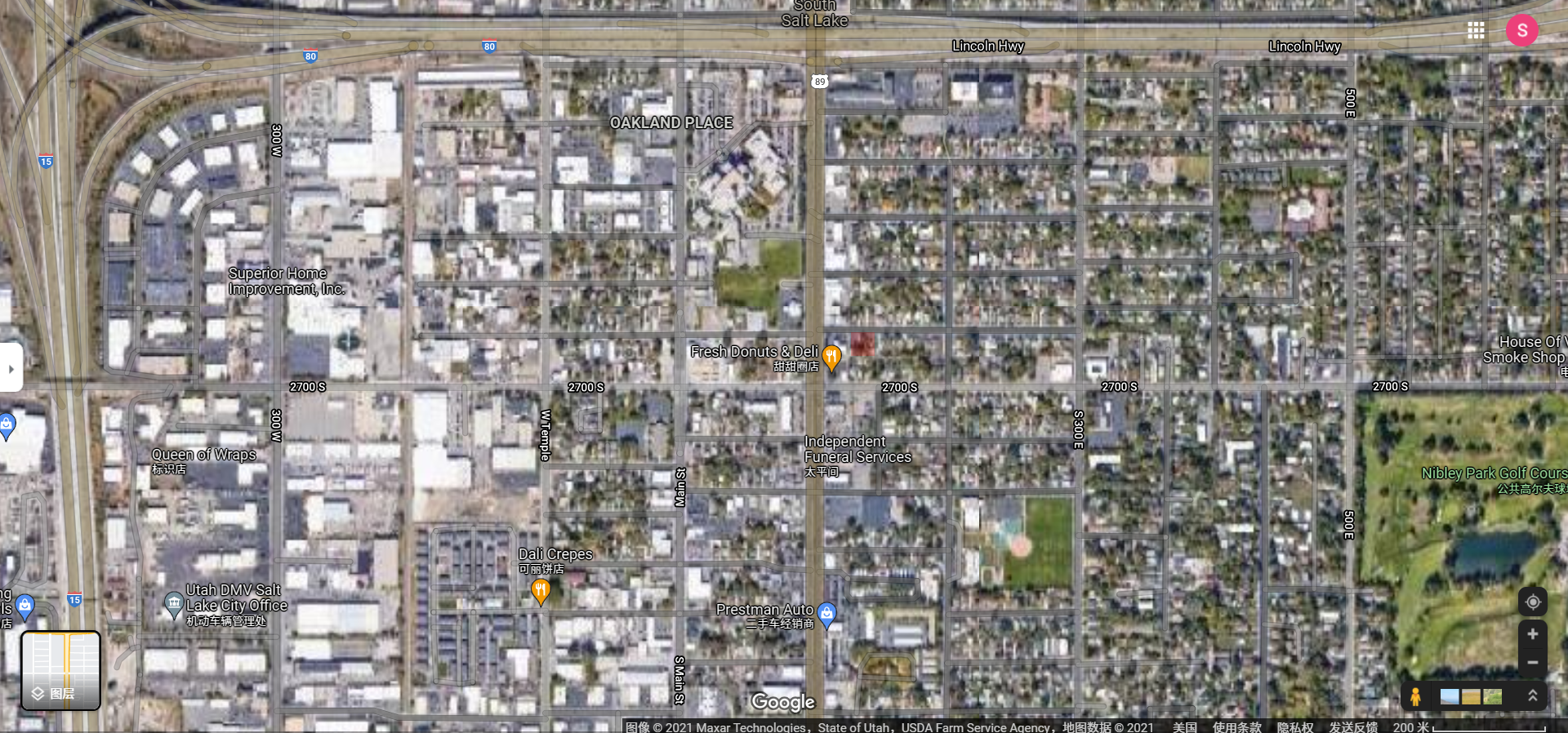
#### Site
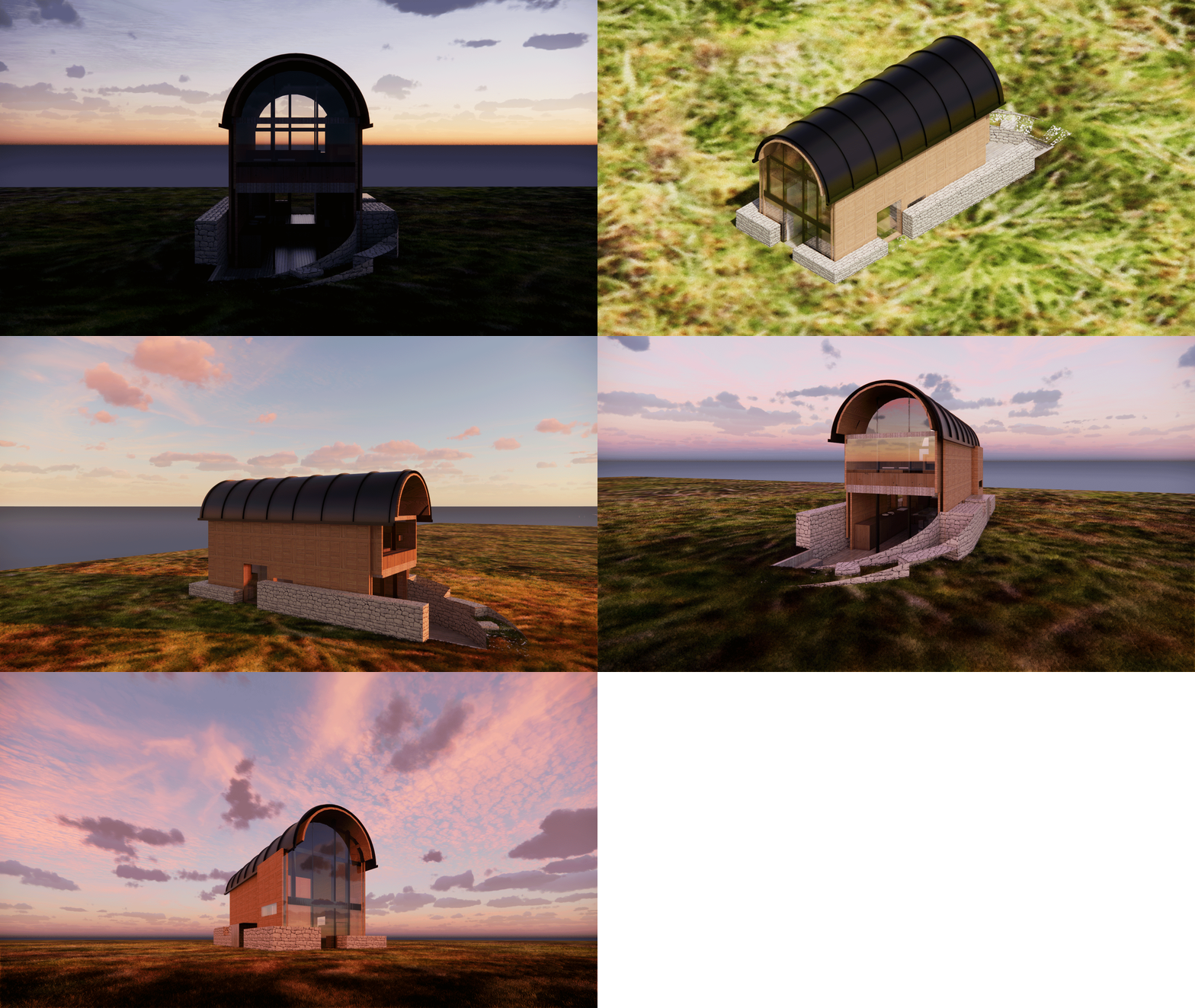
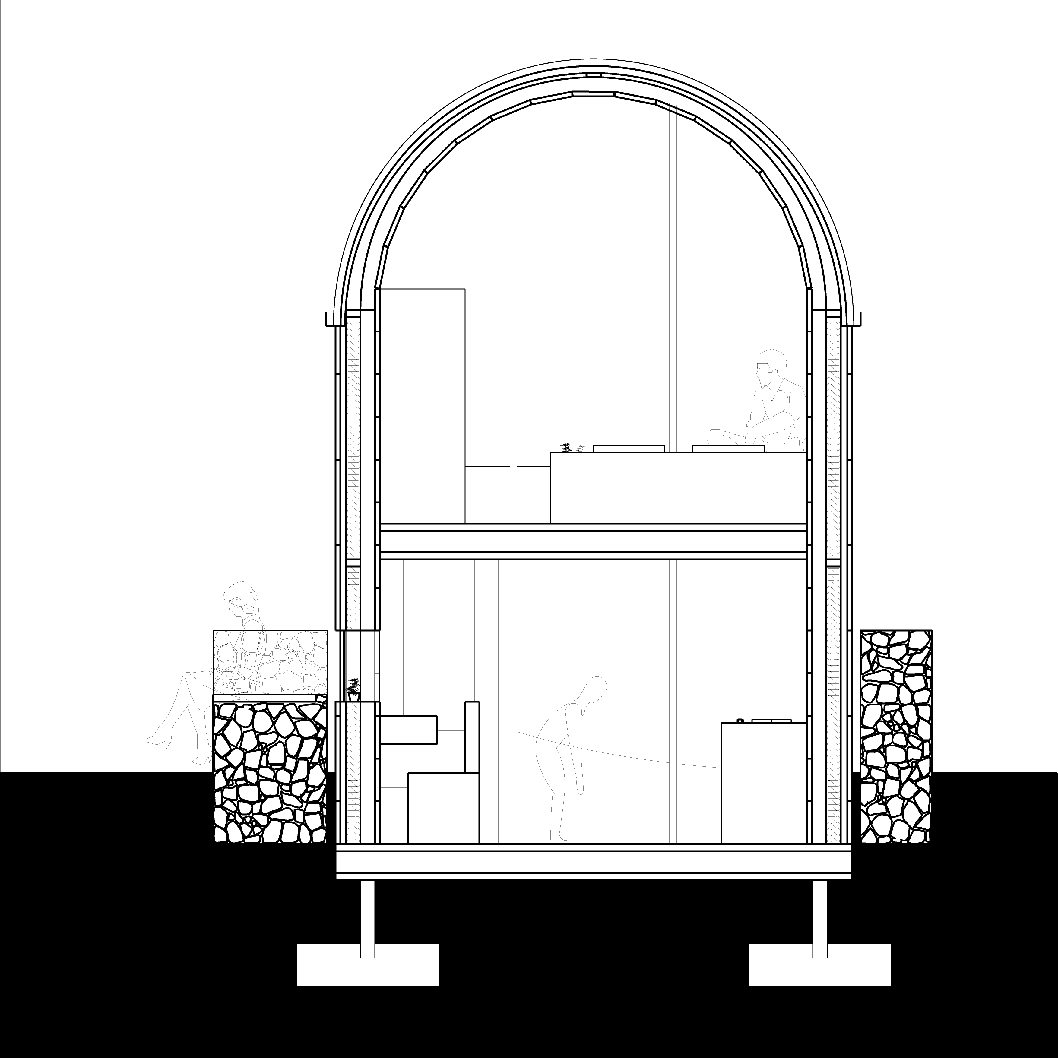
#### Material/Construction/Assembly Copper barrel vault roof. Wood framing walls with natural horizontal wooden board (facade and inner finished) extended to the roof. Gabion walls with plants and seats around the tiny house. Big glass walls with frames on two sides.
#### Typical Owner A middle-income couple who like camping and working out.
### Animation of outside & inside views
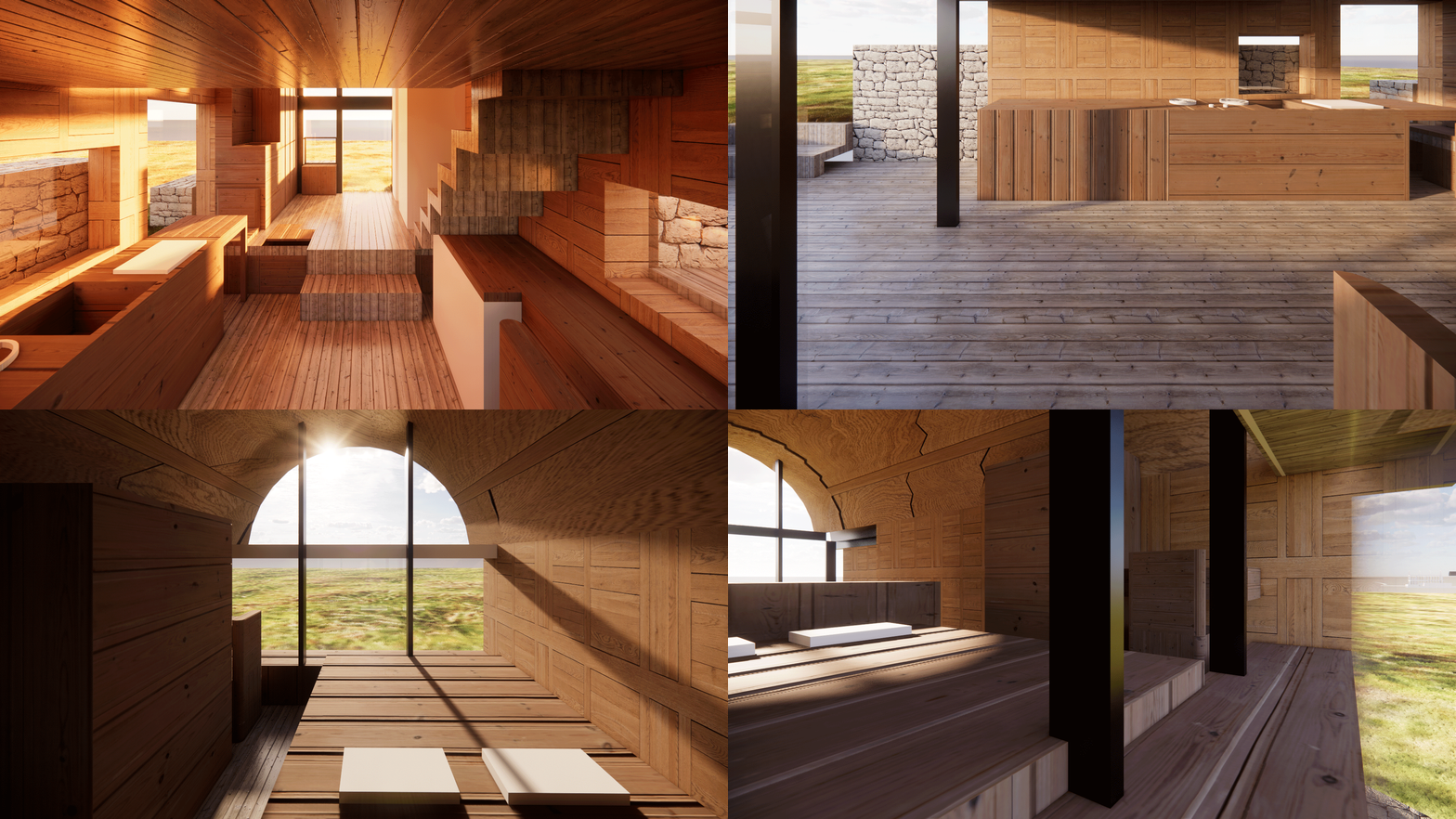
### Photosphere of outside & inside views
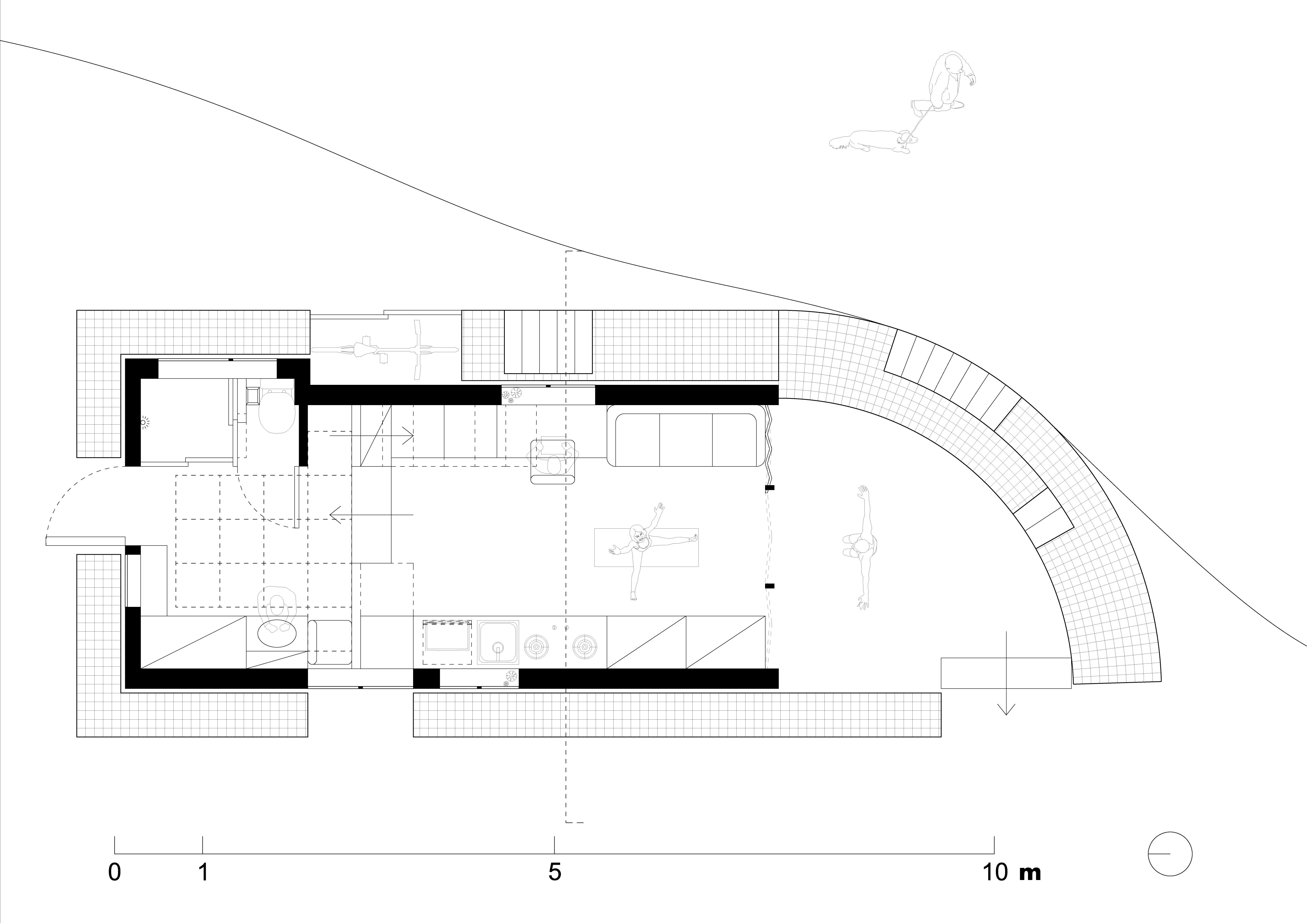
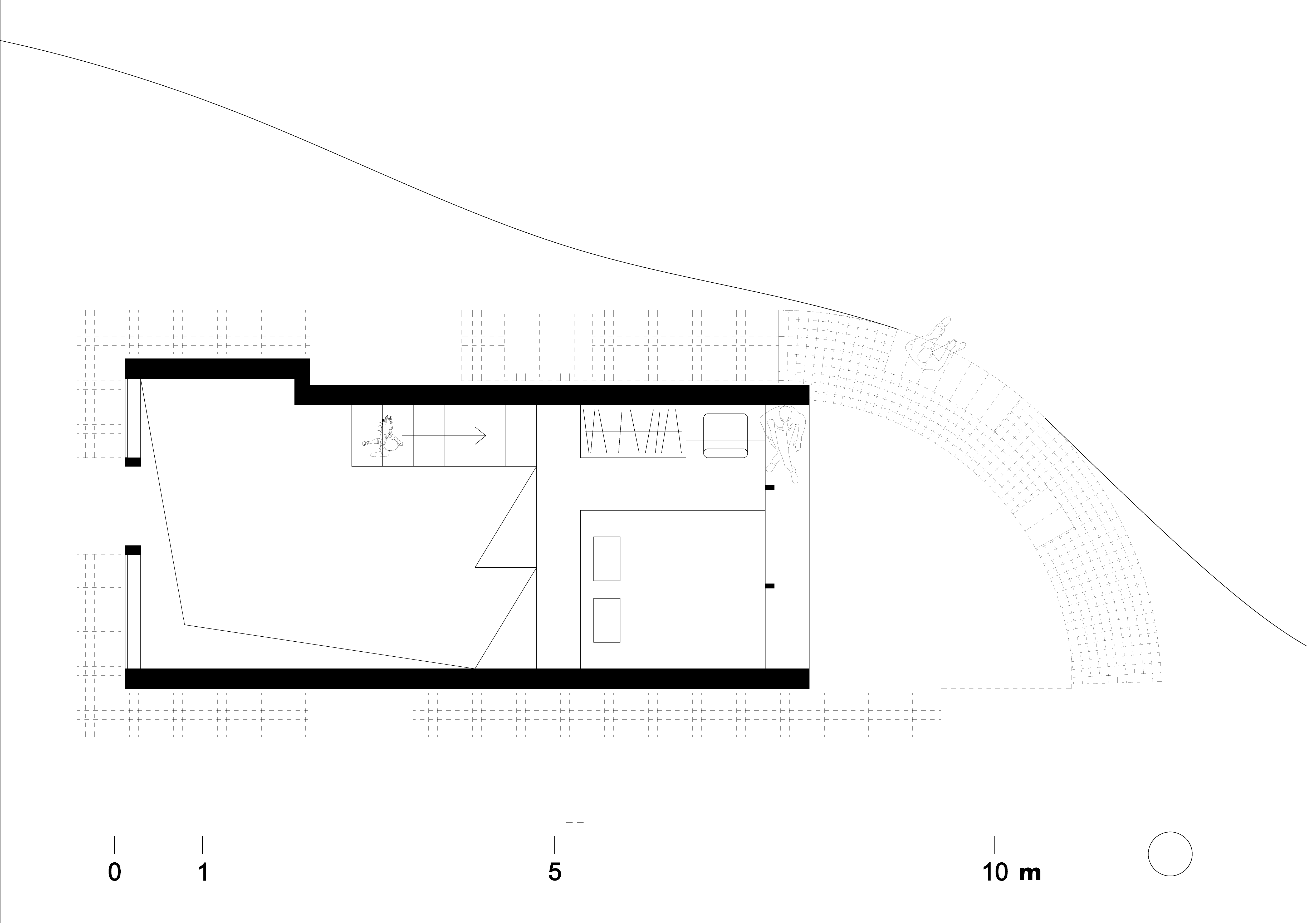
### Plans
### Section
### Process

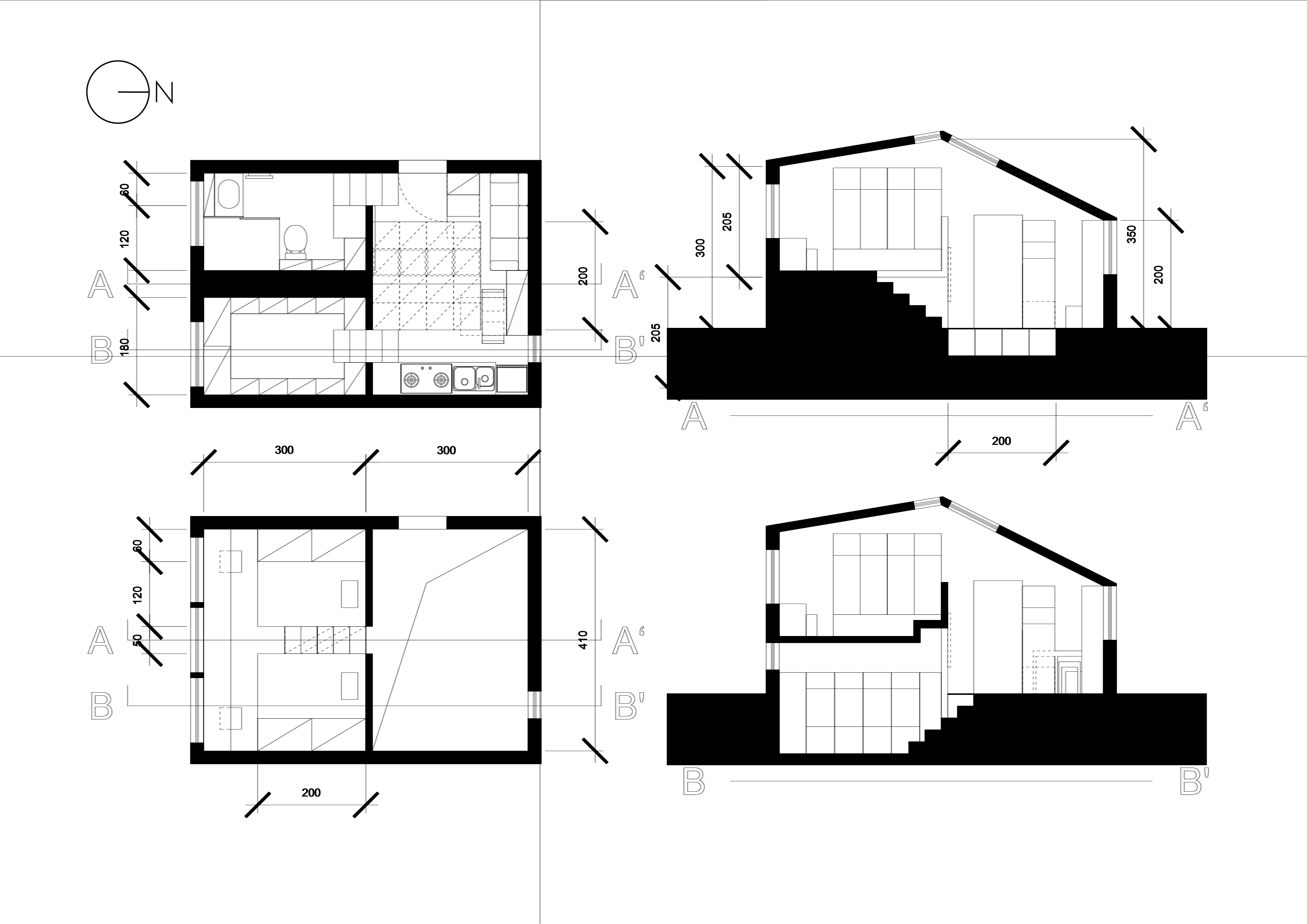
#### Full-scale drawing on the ground
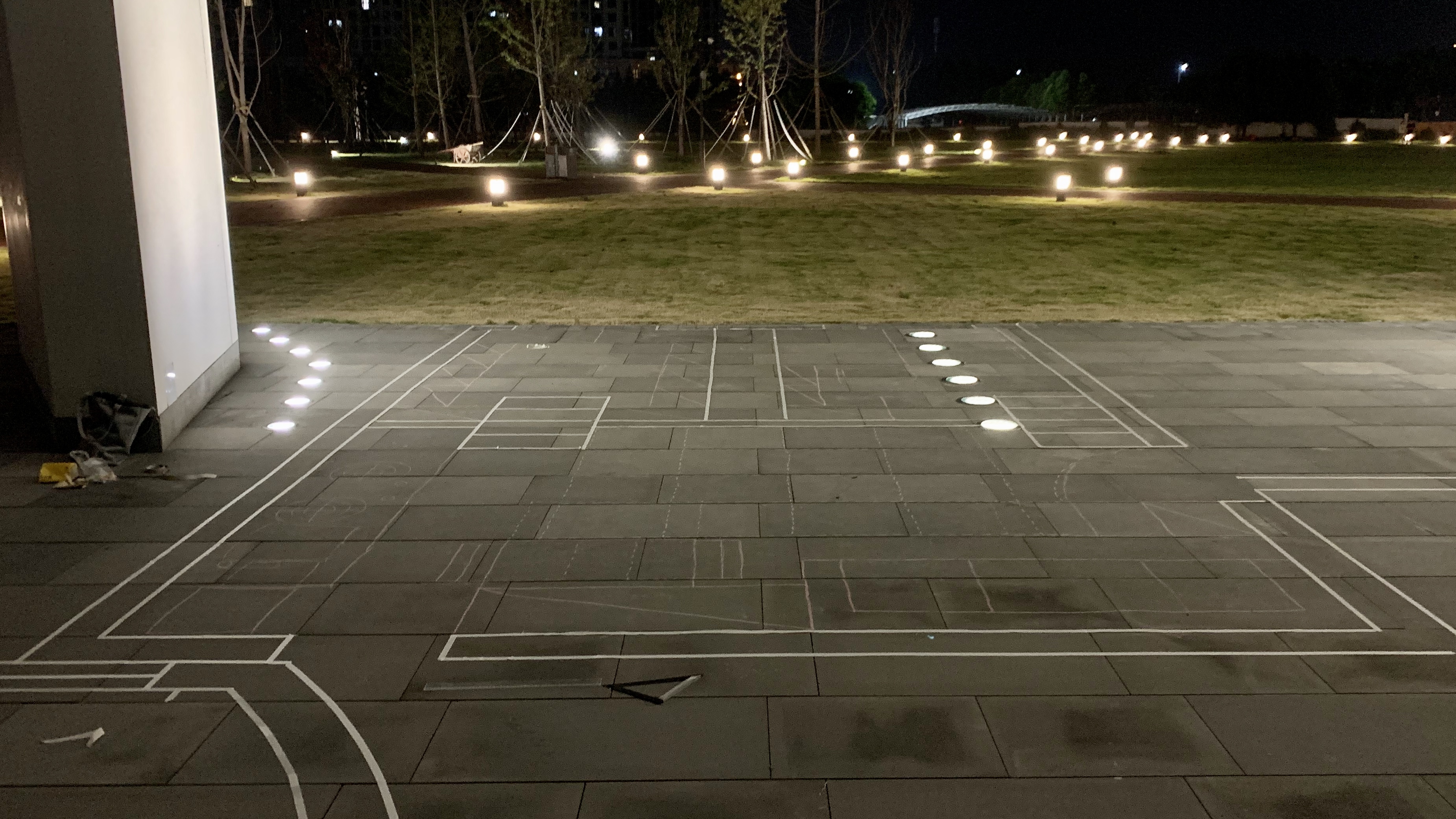
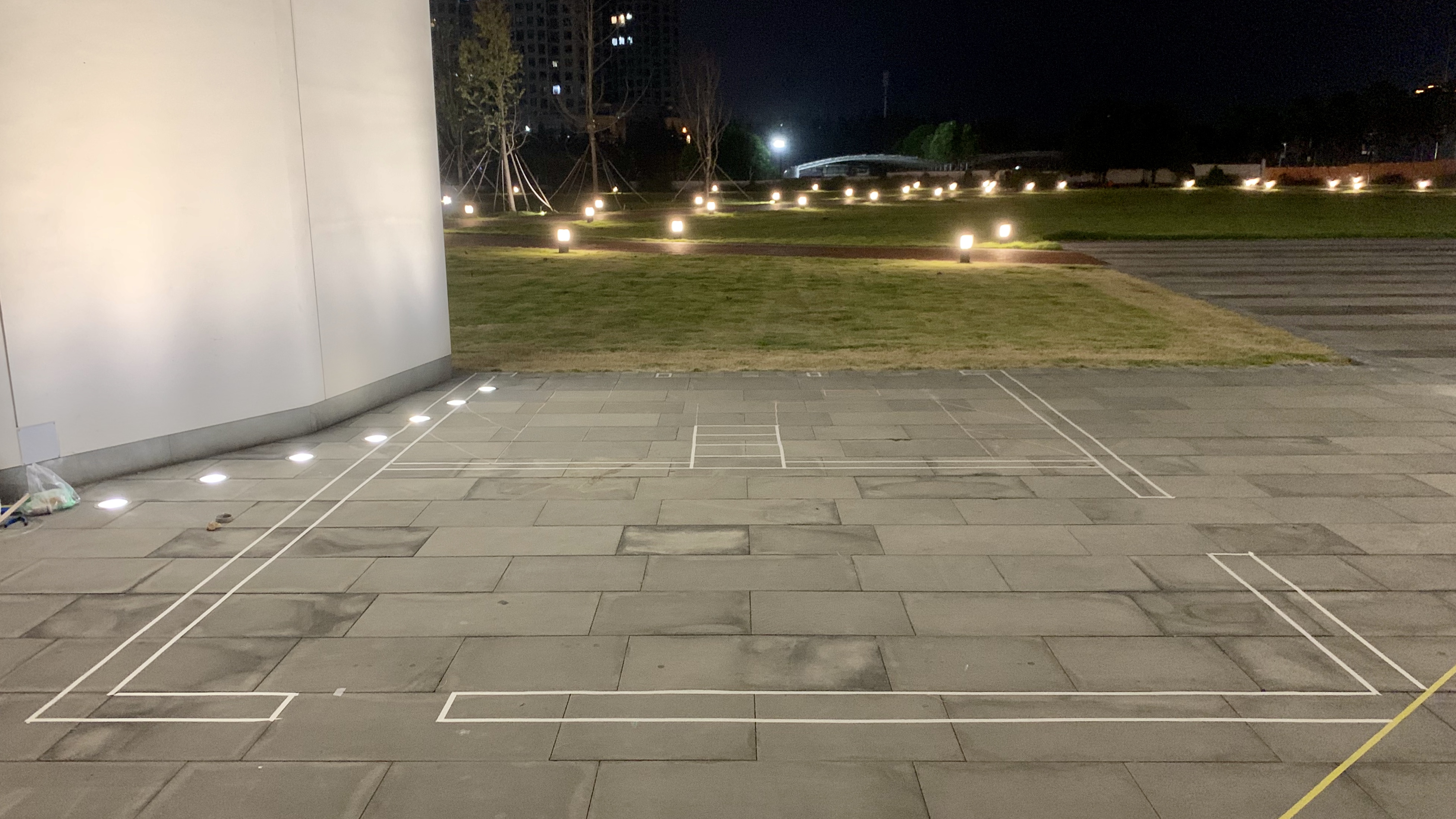 Through this real-scale experience, I feel some inappropriate parts of my design. For example, the stairs are narrow and the tread width is a bit small. The room layout is not reasonable either: there is excessive storage space that should be made for other functions like sleeping area. For now, it did not provide enough privacy for two colleagues living in almost like one single room nor provide itimate space for a couple. It is awkward.
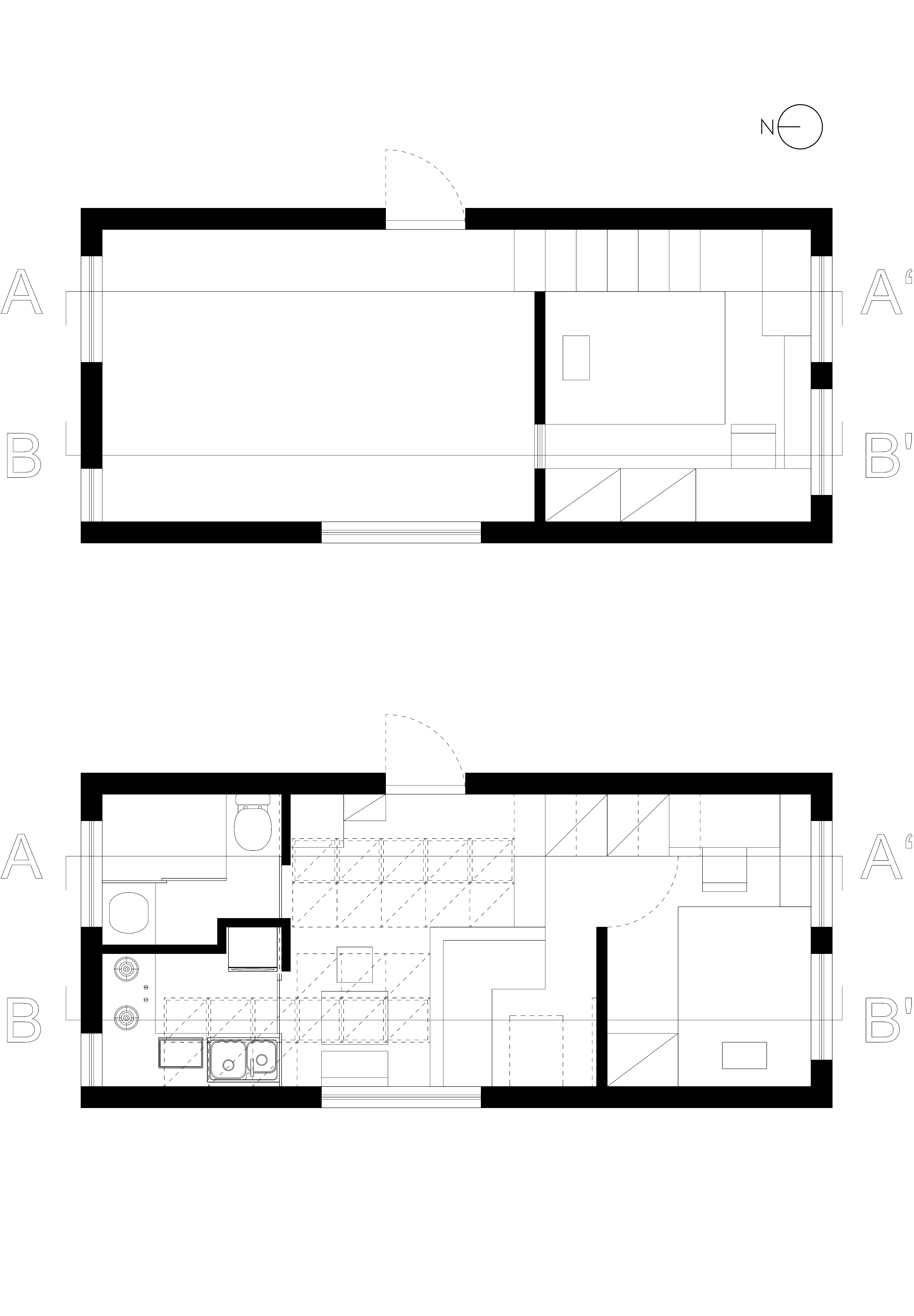 26.4㎡ (1st floor) + 9.9㎡ (2nd floor) = 36.3㎡


Compared to last time’s design, I create more privacy for the two persons living in the home, and rearrange the room to be more rational.
Meanwhile, I keep the underground storage idea. In addition, I add moveable doors to the kitchen and bathroom. When entering the home, the space looks clean, but actually everything is here.
In terms of the roof, I make the south and the center part as skylights to allow sunlight to go inside the upper bedroom and lower living room area; the west and east parts will be attached with solar panel; I’m considering a way to lead the rainwater to go down to the kitchen and bathroom along the roof.


 After finalizing my client and my core conceptual idea, I reorganize the home. The upstairs is a bedroom for the couple, and there are a livingroom, a working area, and a kitchen below. The bathroom and dining area are on a 50cm higher level near the entrance with a large underground storage space. The workout facilities are stored near the kitchen that is extended to a coutyard. All the things are put against the walls on either sides, leaving a large flexible space for workout. Plus, it extends to outside. The exercising environment can be natural and pleasant. The unusually used camping equipments are stored on the second floor hung up and underground, which are organized well and look not messy at all.
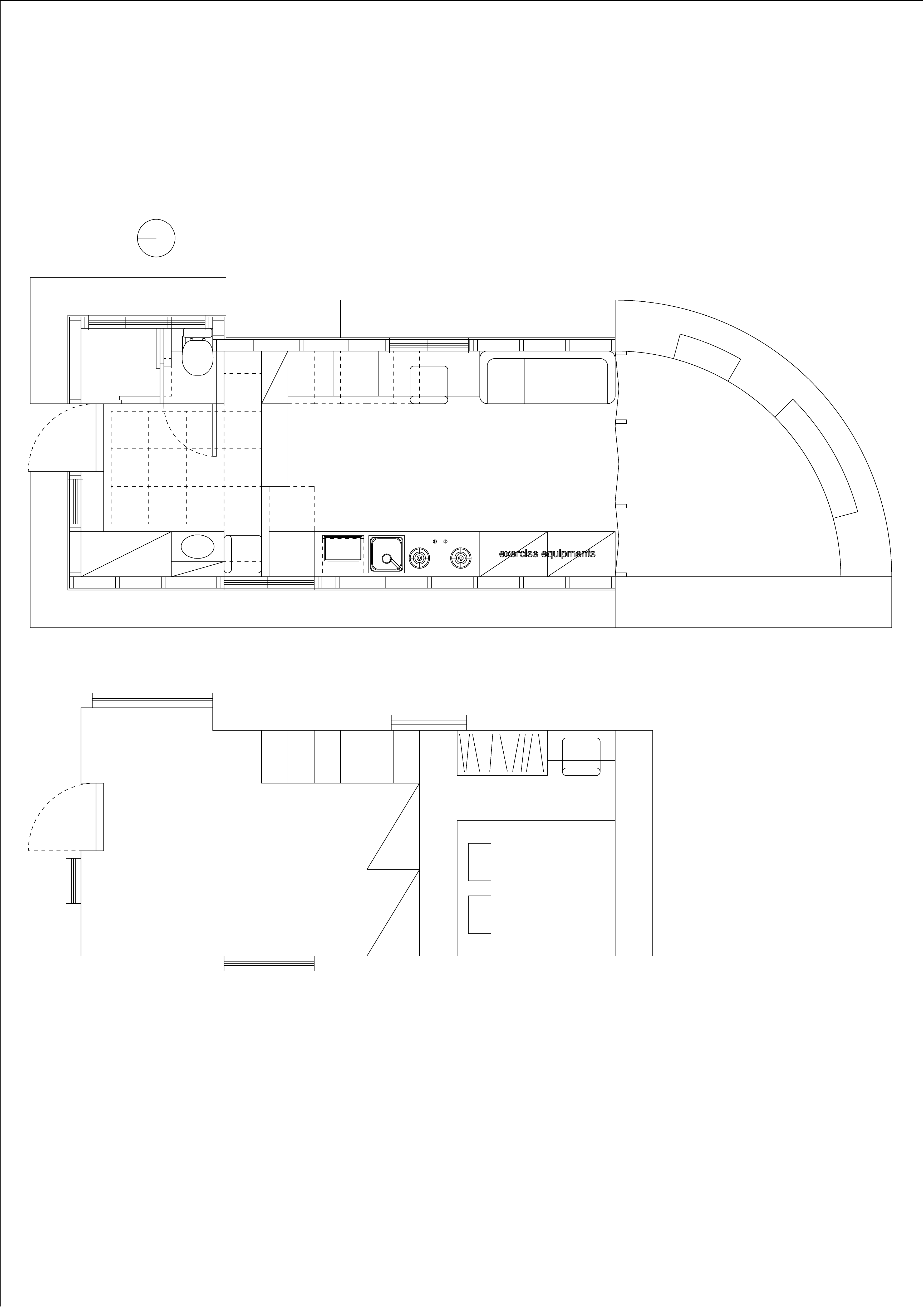
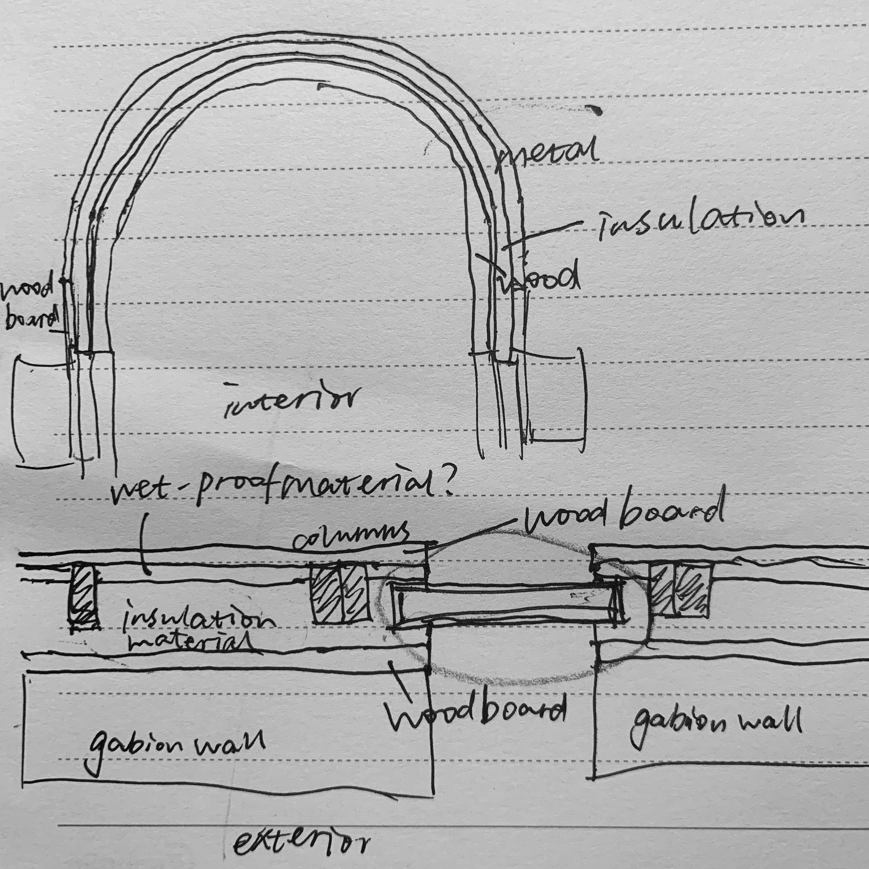
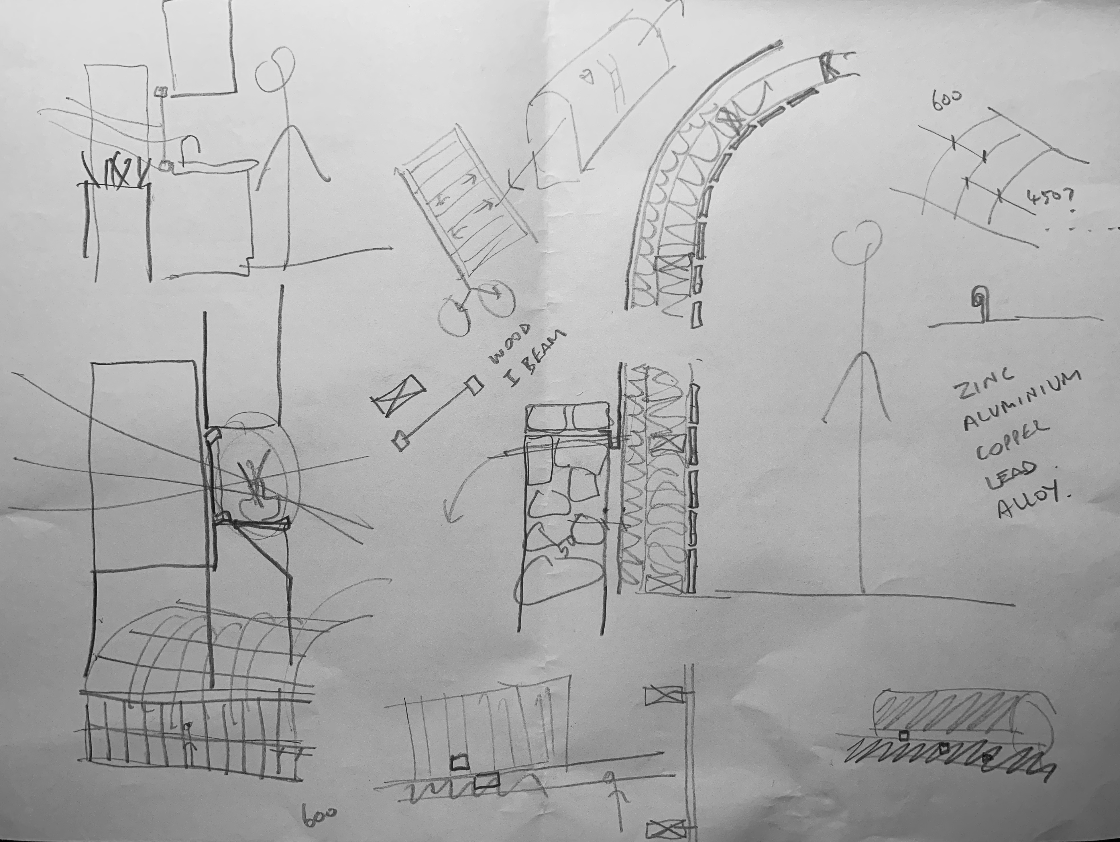 Two sides of all the stuffs and furnitures are strictly following the width of 600mm and 700mm. Looking from the entrance, it is well-organized, spacious, and clean. Also, I shift the arrangement for the bedroom, making it feel more pleasant. In addition, this time, the house connects to the natural environment more. Now I have a more mature idea of the whole project.
### Precedents
 Project of multi-functional living room (48㎡)
A core space in the center of a home with the dweller’s most important spiritual activities happening here (it is like a house in a house).
Plus, under the core space, there are a series of flexible furnitures serving for many functions around the house.
 floor plan
https://www.archdaily.com/801067/living-space-ruetemple?ad_medium=gallery
 OFIS arhitekti, 20㎡
As a temporary house for tourists, it provides not only a cool facade, but also a very good view looking outwards. The minimun interior space provides all essential functions, and the house leaves quite a large “balcony” space. It looks like a future mini spacestation on Mars.
 floor plan
https://www.archdaily.com/890196/glass-pavilion-ofis-arhitekti?ad_medium=gallery
This 60㎡ project in Shanghai gives me an inspiration to design from section instead of plan. Making use of a high floor height (3.5-3.8m), the architect designed 7 kinds of floor height in different functional areas. Plus, the idea of sinking space is also a good reference for me.
 1, 2, 3 section
4 plan
5 low bed with low back provides a high visual effect
6 creating a sinking livingroom by lifting the floor, much storage space is produced
7 a sinking bathtub
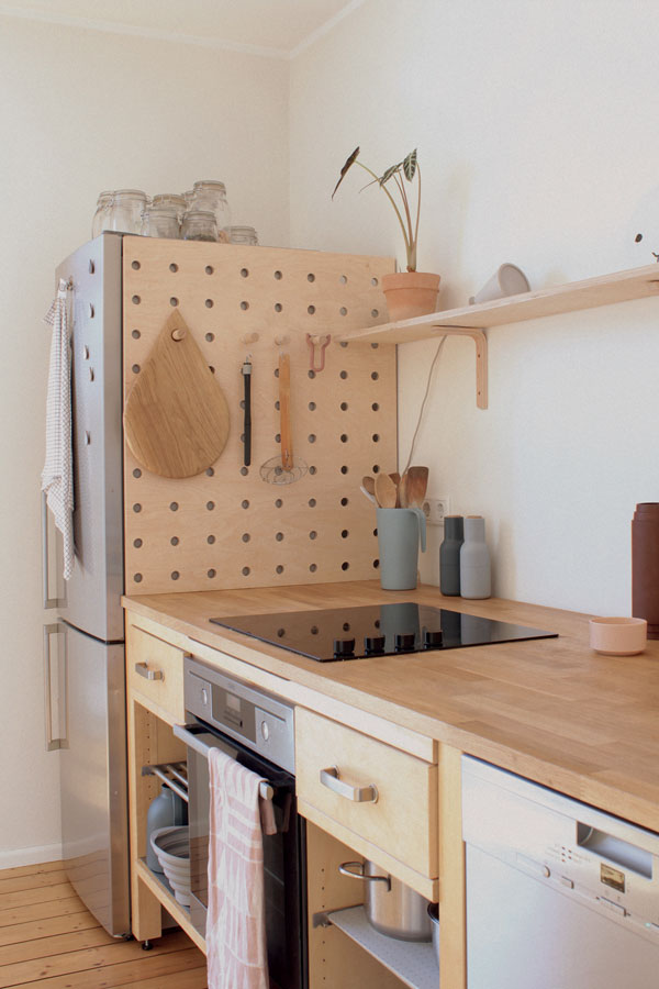 https://www.organized-home.com/posts/kitchen-of-the-week-an-artful-kitchen-created-from-reclaimed-ikea-parts-extreme-budget-edition/
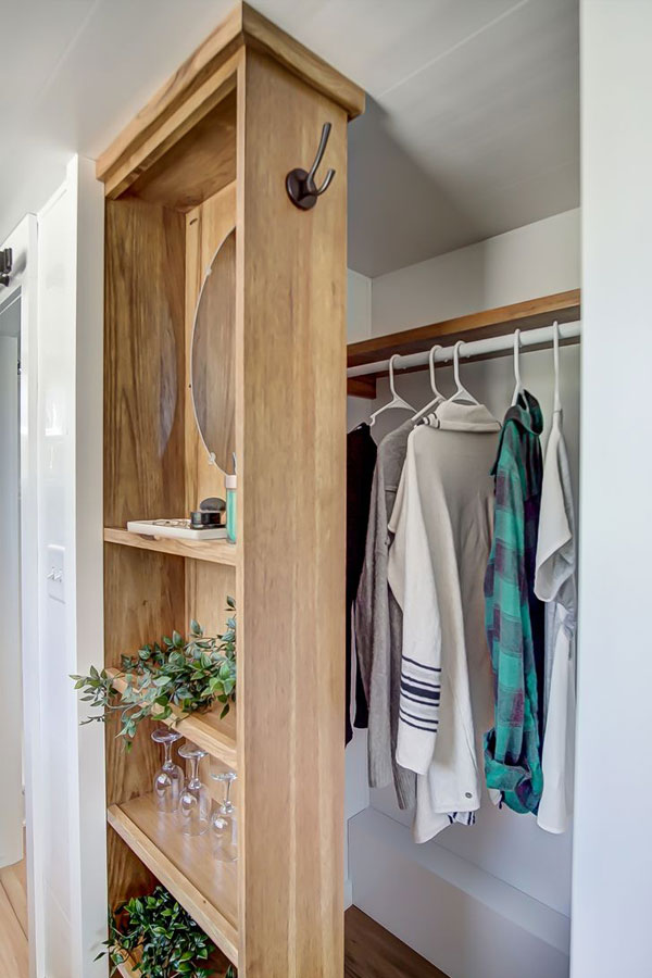
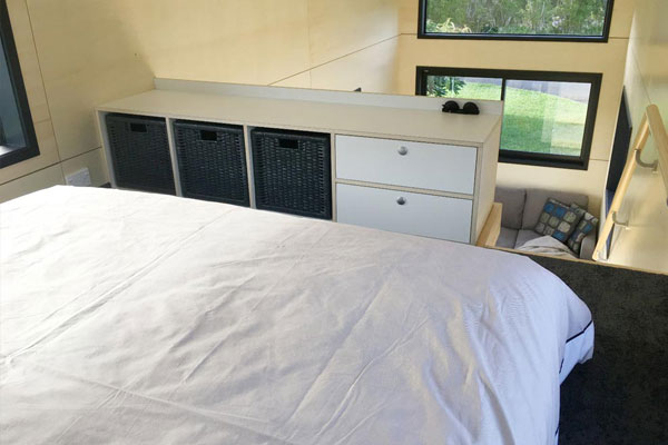
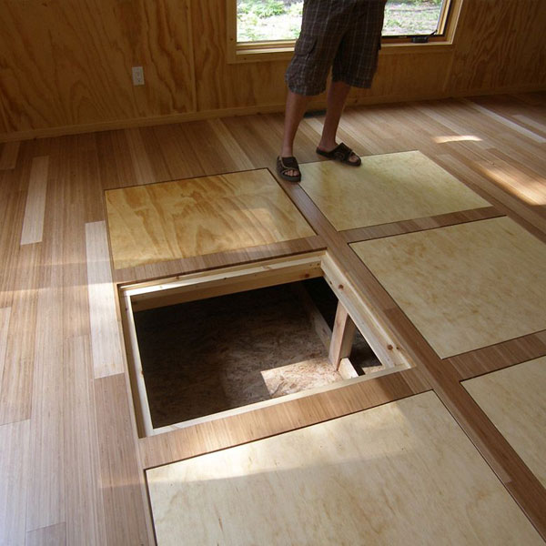
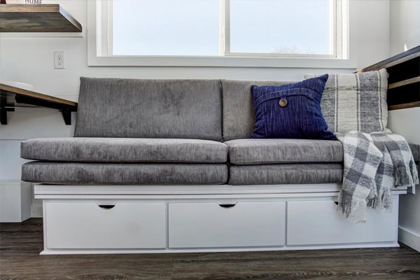 https://thetinylife.com/tiny-house-storage/
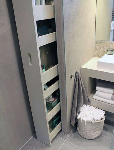 https://thetinylife.com/designing-your-dream-tiny-house-bathroom-advice-from-a-full-time-tiny-houser/
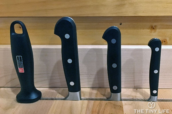 https://thetinylife.com/tiny-house-kitchen-ideas-and-inspiration/
 image from Yoosuf Ahuzam Mujthaba’s pinterest board
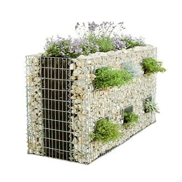 gabion wall with plants from Alibaba
 https://www.homegardenvt.com/gabion-garden-furniture-ideas/